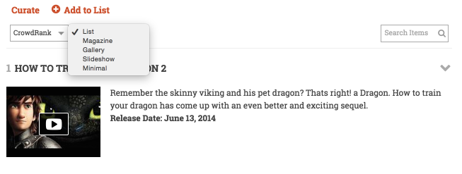
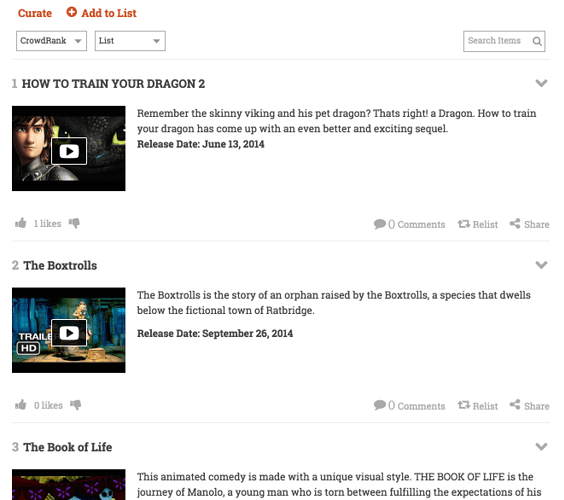
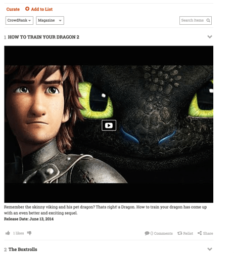
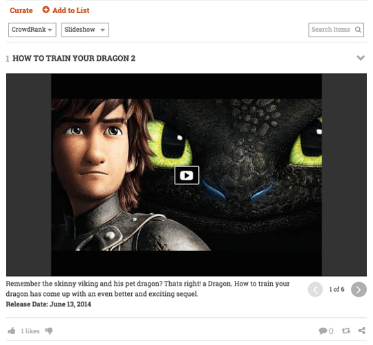
Listly lists can be displayed in multiple layouts. List Layout and Magazine Layouts are free on all lists. Minimal, Gallery, and Slideshow layouts are available to Pro users
- List Layout (small image on the left and description on the right)
- Magazine (large image followed by description)
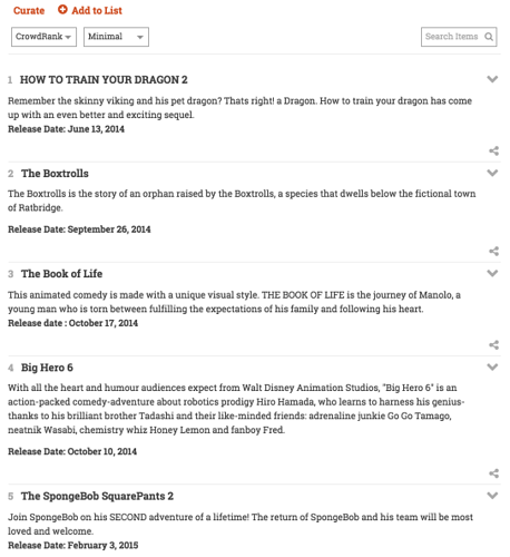
- Minimal (no image, simple text)
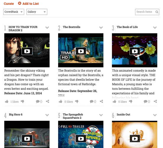
- Gallery (Grid based layout with emphasis on images)
- Slideshow (large image and description, one at a time as a slideshow)
Here is a video describing the Listly layouts, and what follows is more detailed written information on the same topic.
Listly comes with various layouts that allow you to present your list in many ways based on the list content. They are List, Magazine, Slideshow, Gallery, and Minimal.
List Layout
The List Layout has a thumbnail on the left and the description on the right.
Magazine
Highly visual and with the image spanning the horizontal area. Make sure you upload a high resolution image for your items so they look good in this layout.
Slideshow
A slideshow of all items in a list. As visual as the magazine layout, but one item at a time.
Gallery
A grid-based layout with emphasis on images and use of space.
Minimal
A simple list layout with images hidden. Great for tips, quotes and other text oriented lists that is easy to read.
Setting Default Layout for Your List
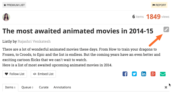
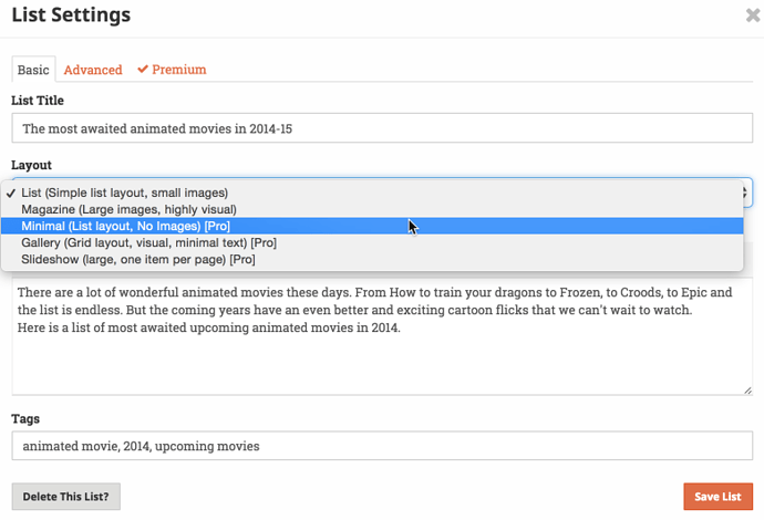
As a list owner, you can choose a default layout in list settings. Here’s how to set the default layout for your list:
On the list page, click on “Edit” drop down menu in the header of the list and pick “List Settings”
You can then choose default layout for your list:
Layouts on the Fly
A reader views the list in your chosen default layout, but can switch layouts on the fly from the list toolbar. Regardless of whether you are a Pro user or not, the reader can choose to view your list in any layout.
